Holy Hotdish
Building a bold fast casual brand rooted in comfort food and playful storytelling
PROJECT OVERVIEW
Holy Hotdish is a branding and packaging development project centered on creating a fast casual restaurant concept inspired by tater tot hotdish, a beloved Midwestern comfort food. The project reimagines this nostalgic dish through a modern, energetic brand experience that feels both approachable and memorable.
THE CHALLENGE
Fast food branding often relies on predictable visual systems that prioritize speed and recognition but lack personality or emotional connection. The goal was to design a restaurant identity that feels playful and engaging while maintaining a cohesive and professional execution across all touchpoints.
THE CONCEPT
Holy Hotdish transforms a classic comfort food into the centerpiece of a bold fast casual dining experience. Inspired by Midwestern culture and nostalgia, the concept embraces warmth, humor, and familiarity while introducing a modern and expressive visual identity.
Creative menu variations position hotdish as customizable, shareable, and fun. The brand reflects this through playful messaging and energetic design choices that invite a wide range of customers to engage with the experience.
DELIVERABLES
Brand Identity, Restaurant Identity System, Packaging Design Suite, Takeout and To Go Packaging, Art Direction
MY ROLE
Brand Designer, Packaging Designer, Art Director

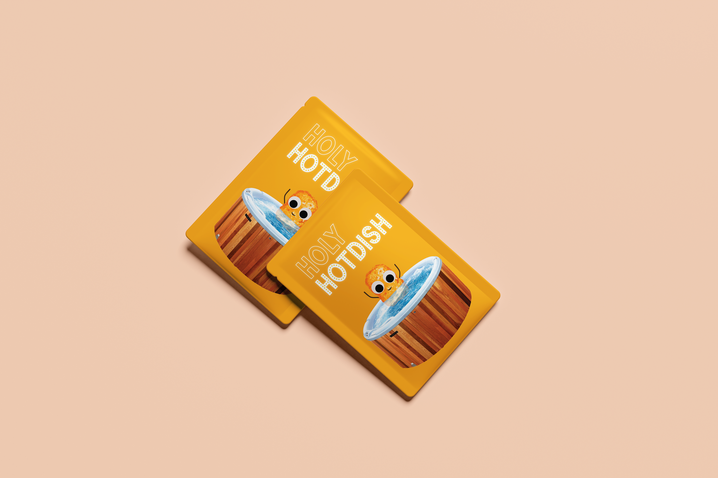
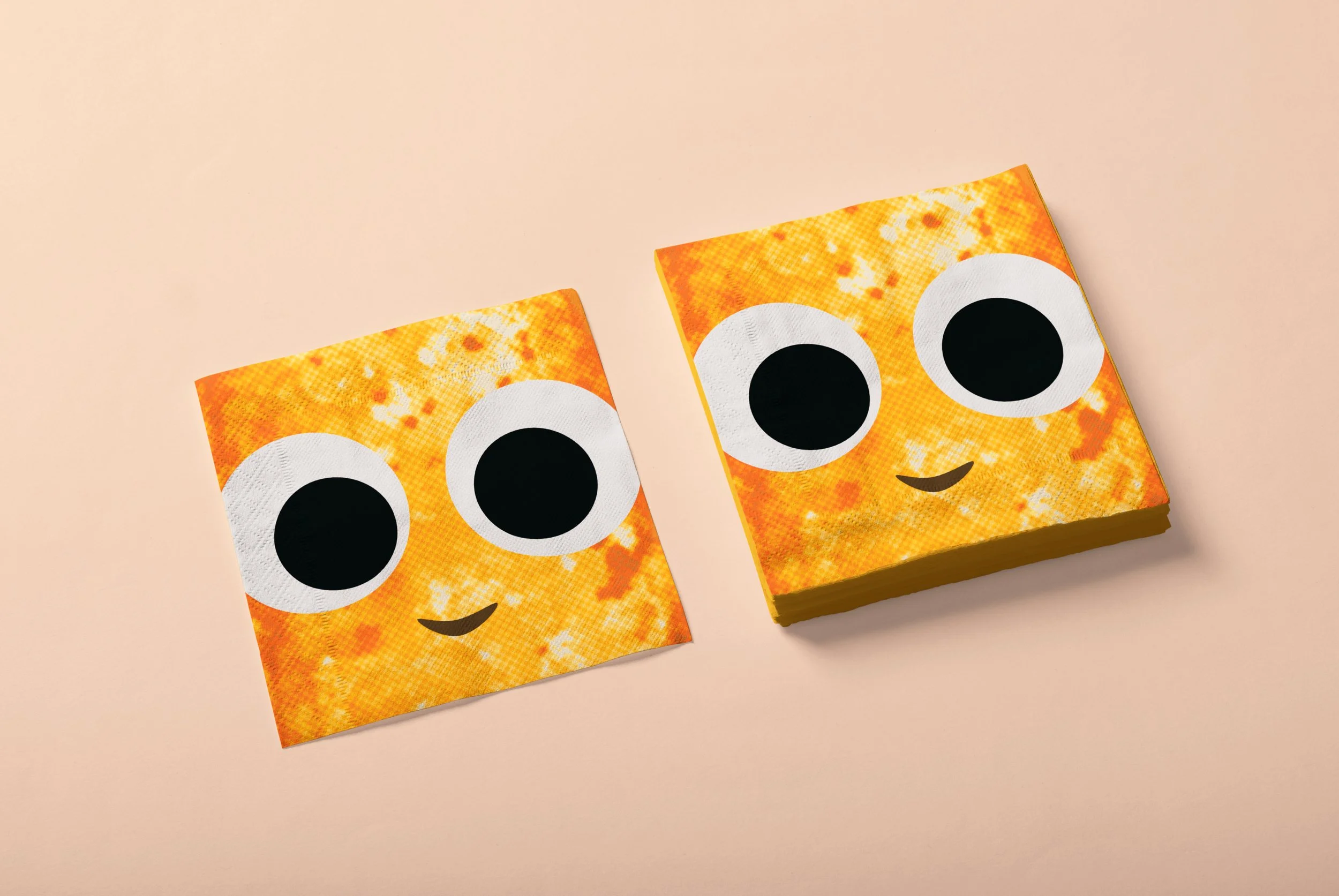
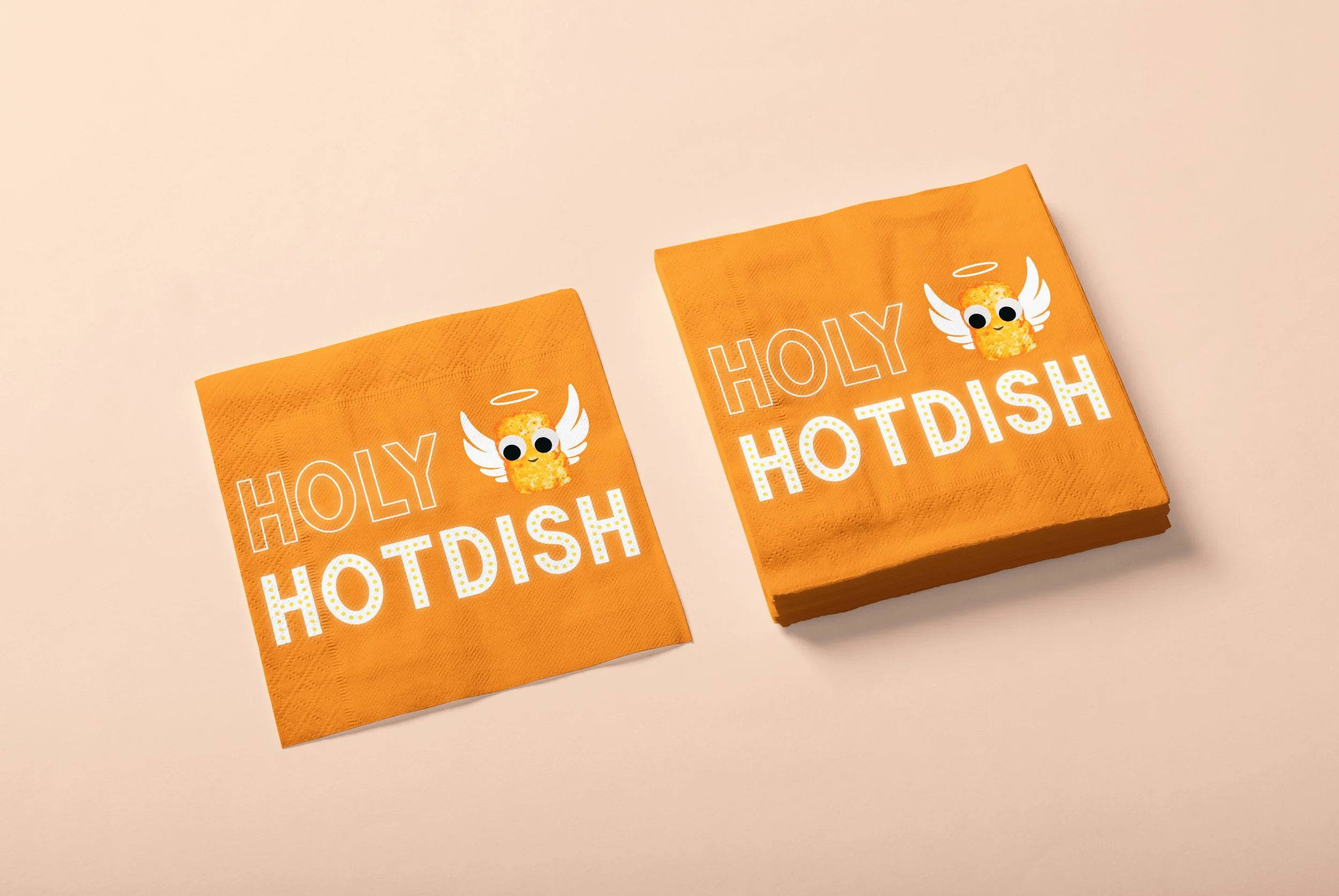
BRAND IDENTITY
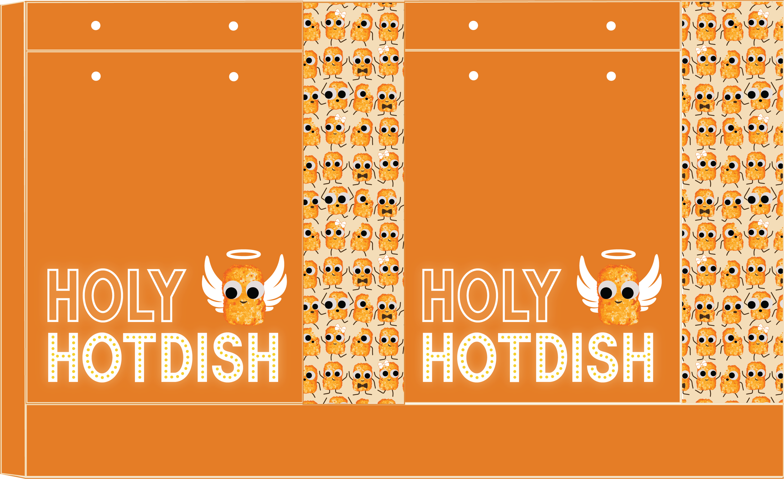
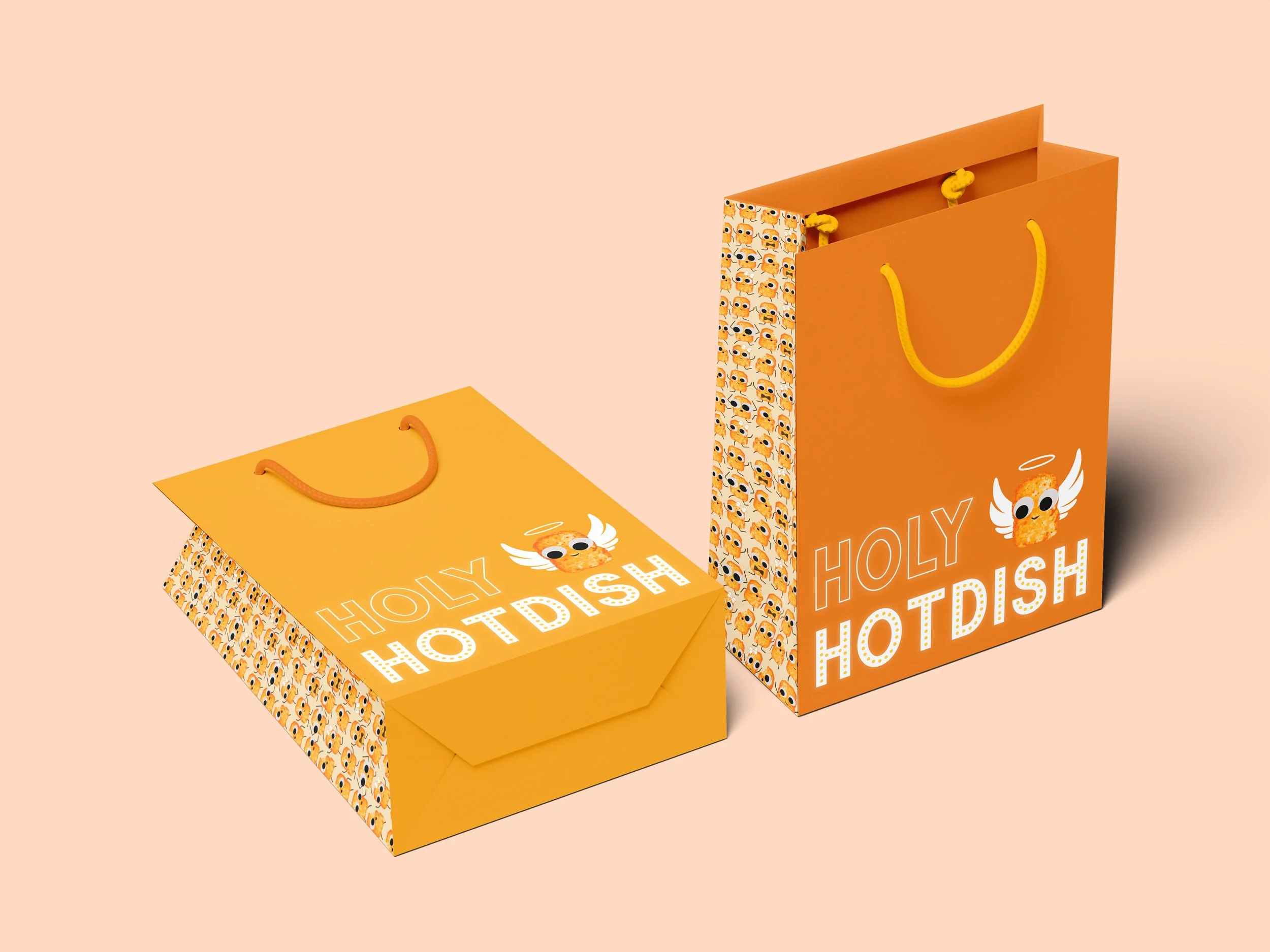
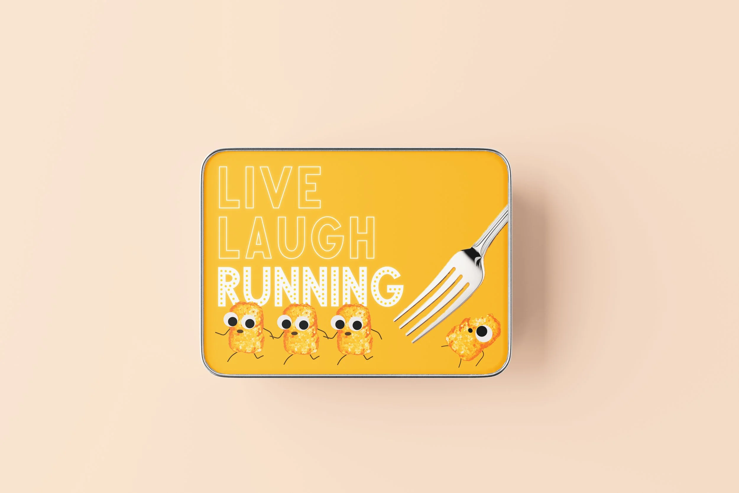
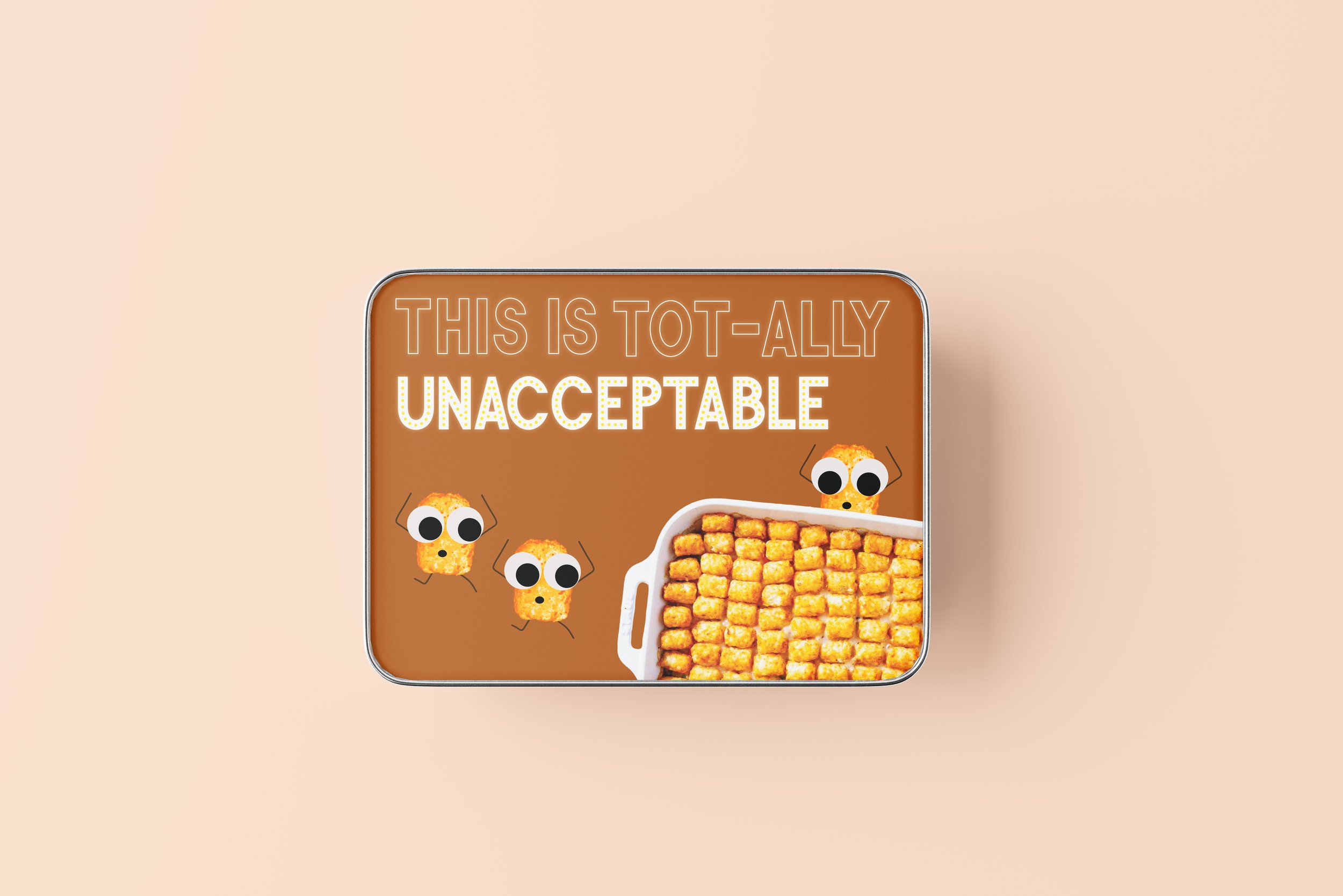
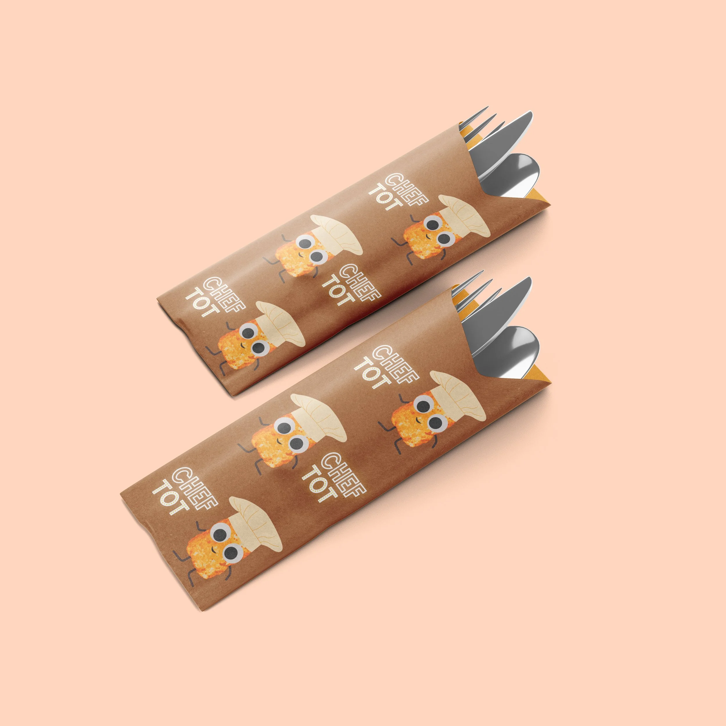
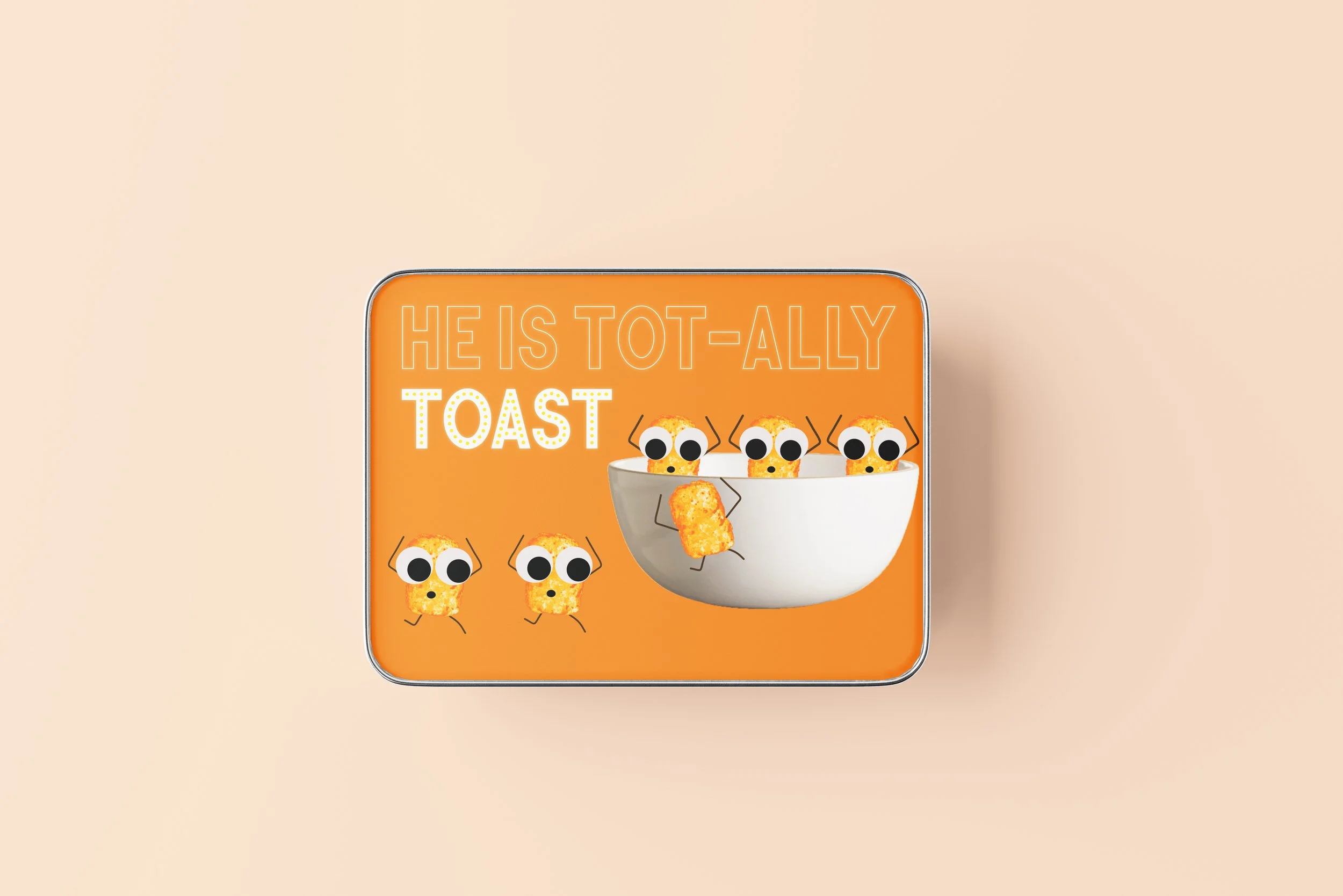
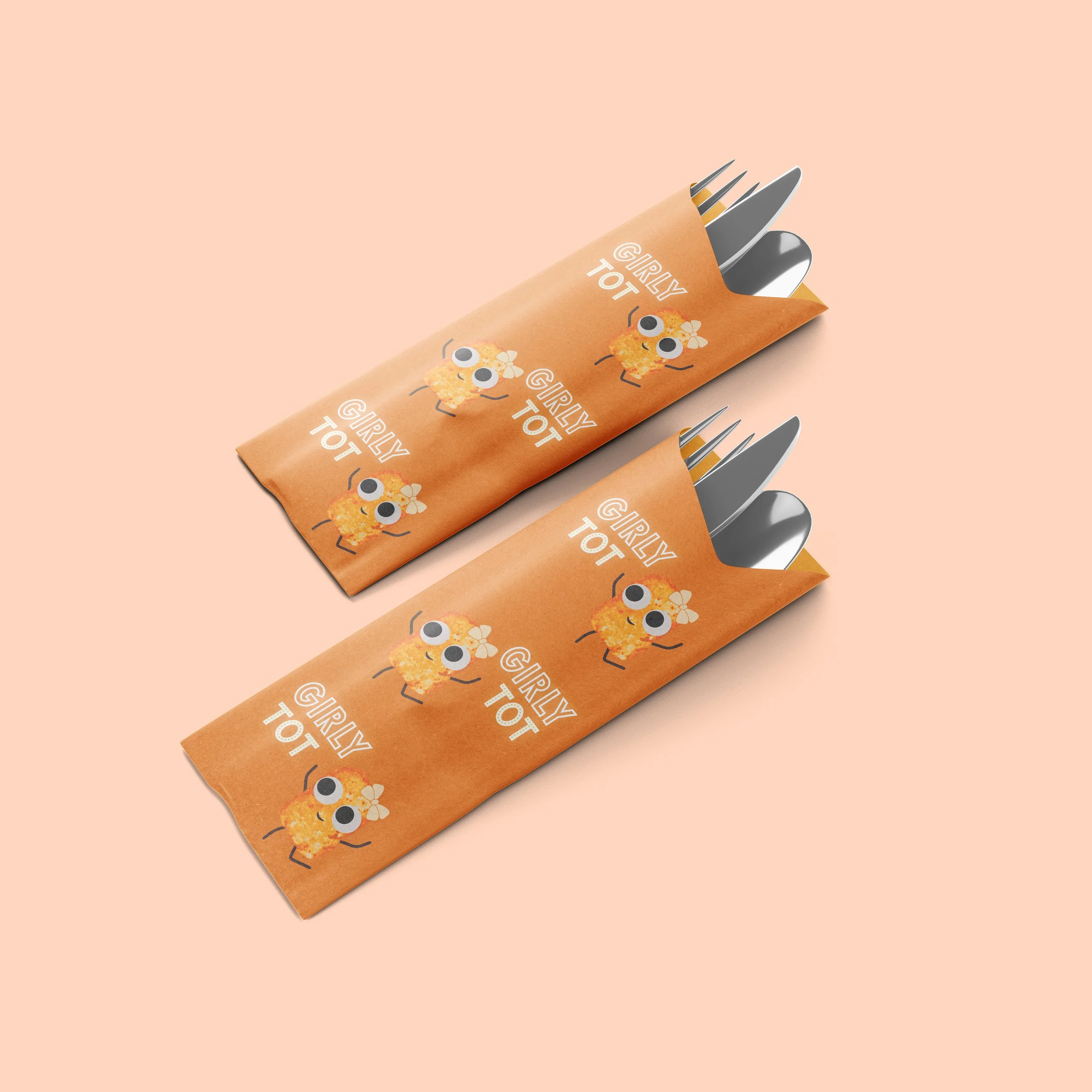
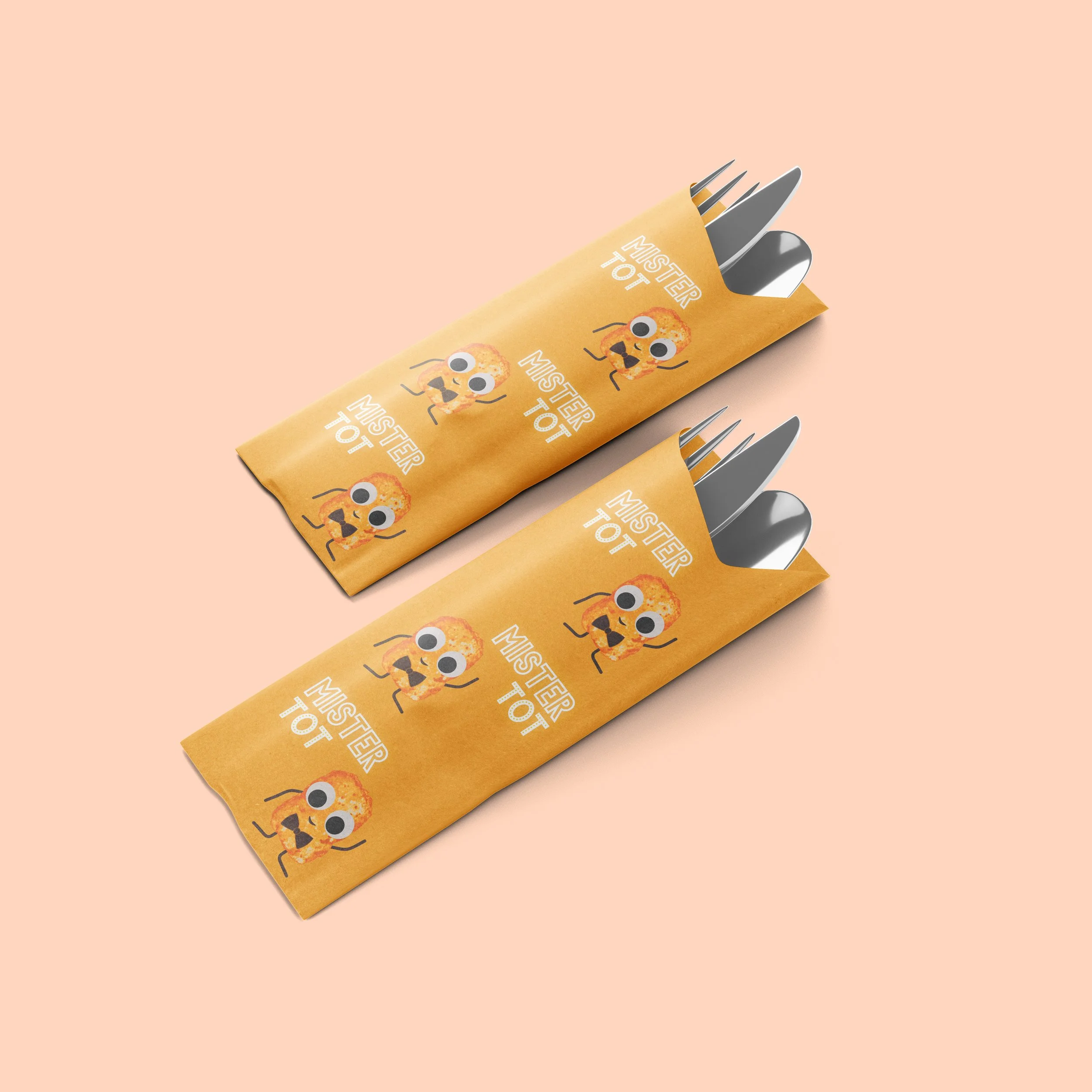
The identity system was designed to feel warm, quirky, and instantly recognizable. A halftone tater tot graphic acts as a signature visual element, adding texture and reinforcing the core product in a playful way.
A bright and warm color palette enhances approachability, while whimsical, pun inspired phrases introduce personality and humor throughout the brand. The result is a cohesive system that balances bold expression with polished execution.

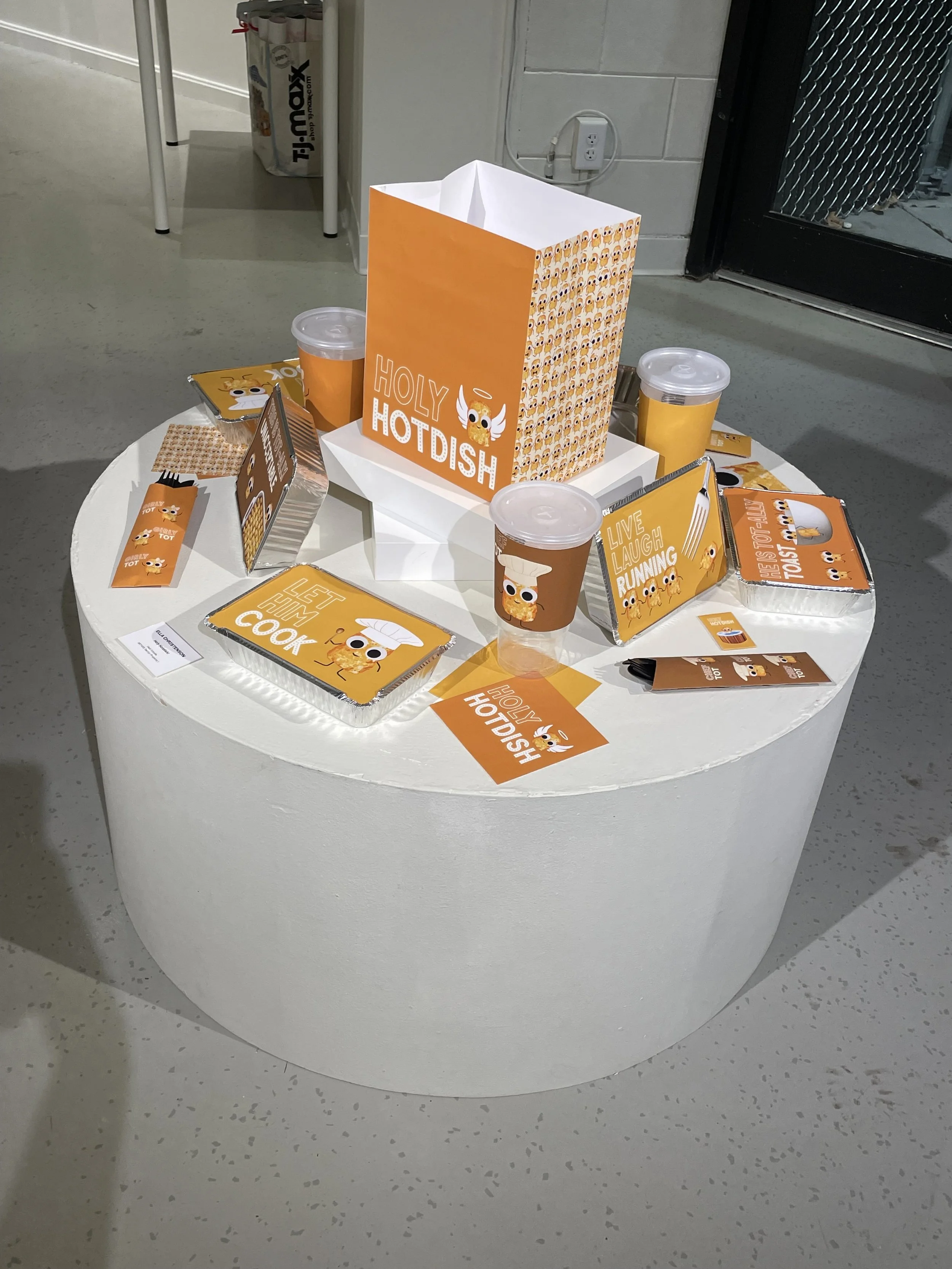
PACKAGING EXPERIENCE
The project expanded into a full packaging system designed to support the entire customer journey. Applications include takeout bags, food containers, beverage cups, napkins, silverware holders, and wet wipes.
Each touchpoint reinforces the brand identity, creating a consistent and memorable experience from ordering to dining to takeaway. Packaging becomes an extension of the brand’s storytelling rather than just a functional element.


DESIGN IMPACT
Holy Hotdish demonstrates how strong branding can elevate a regional comfort food into a scalable and memorable restaurant concept. Through cohesive design and personality driven storytelling, the project transforms everyday dining into a distinctive brand experience.

BEHIND THE SCENES
Process played an important role in shaping the final brand. Early exploration included logo development, visual identity testing, and brand voice experimentation to define the tone of the concept.
Packaging applications were refined through multiple iterations, exploring layout, hierarchy, and how graphic elements translate across different formats. This process ensured consistency while allowing each piece to feel intentional and engaging.