Drizzle n’ Dip
Reimagining culinary packaging through culture, color, and celebration
PROJECT OVERVIEW
Drizzle n’ Dip is a branding and packaging development project that reimagines everyday culinary staples as vibrant, giftable brand experiences. Focused on balsamic vinegar, olive oil, and cooking wine, the project challenges the traditionally minimal aesthetic often associated with specialty food products.
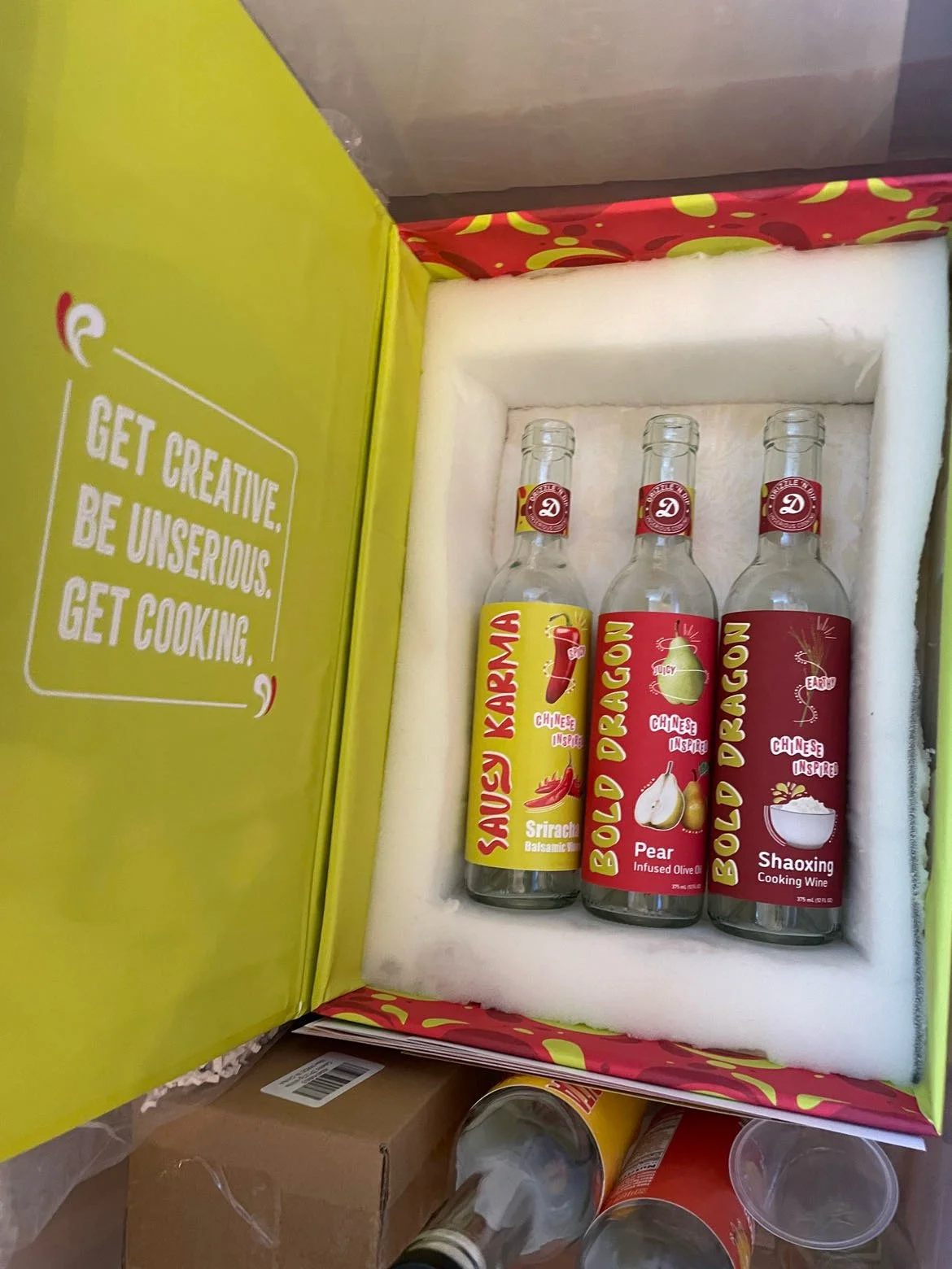
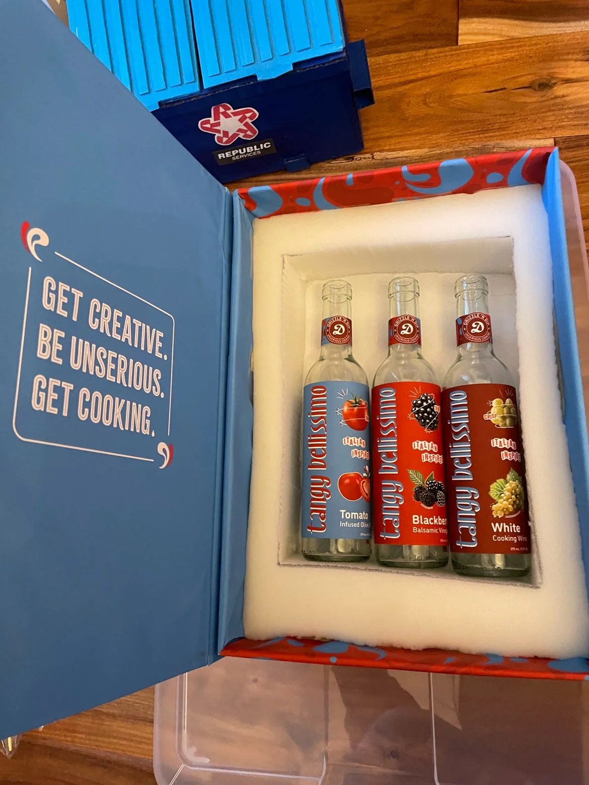
Originally developed as a three product system, the concept expanded into a full collection of nine bottles and three curated gift sets, each inspired by a different global cuisine. The result is a playful and expressive brand that makes gourmet ingredients feel approachable and engaging.
THE CHALLENGE
Specialty cooking products are often marketed through minimal and refined packaging systems that can feel exclusive or impersonal. The goal was to design a system that breaks away from these conventions while still maintaining cohesion and clarity.
The challenge was to create a packaging system that feels vibrant and inviting, appeals to a broader audience, celebrates global cuisine, and functions seamlessly across both retail and giftable formats.
THE CONCEPT
Drizzle n’ Dip transforms pantry staples into curated cultural experiences. Rather than treating each product as standalone, the brand groups them into themed collections that invite exploration through food.
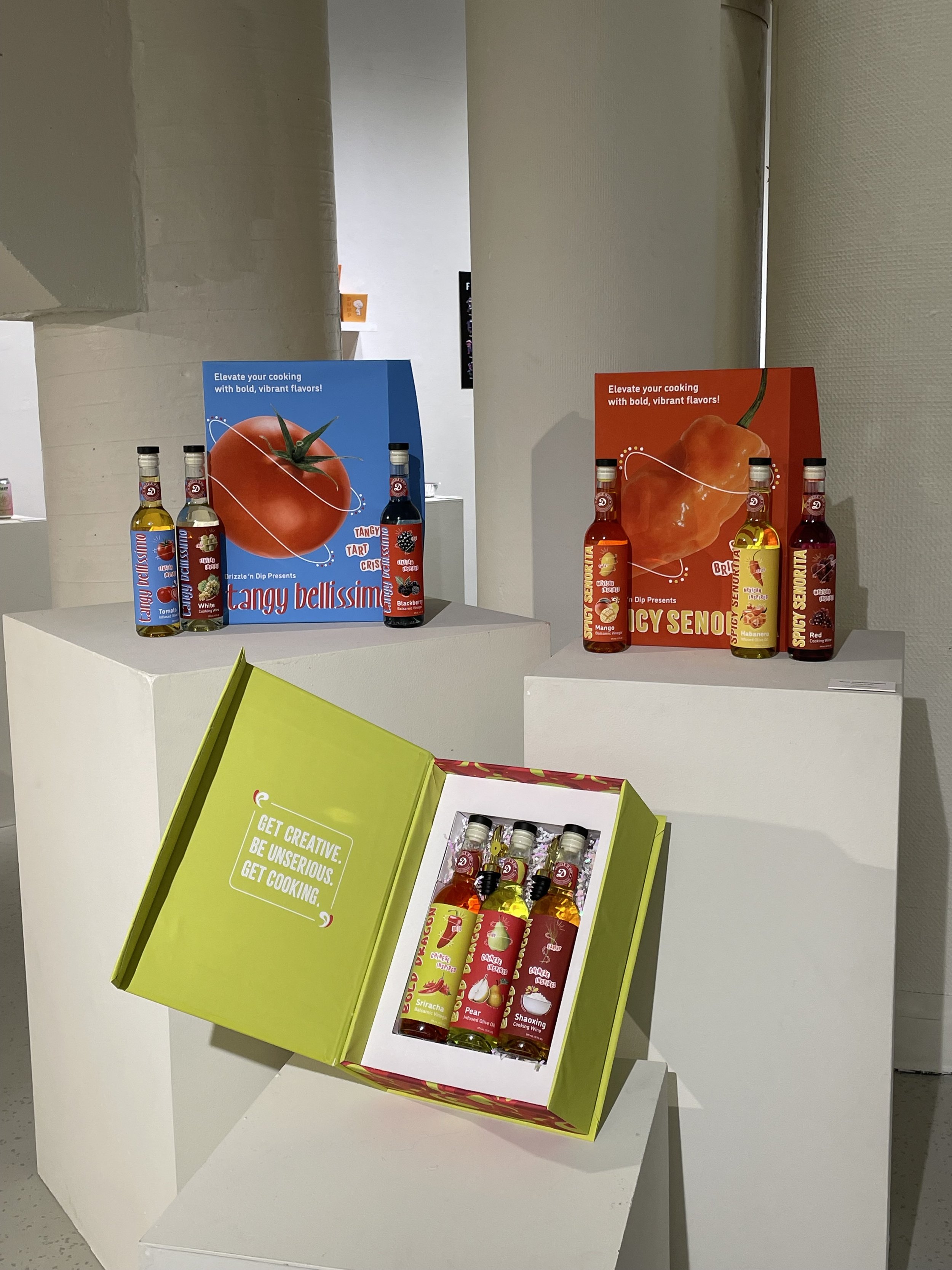
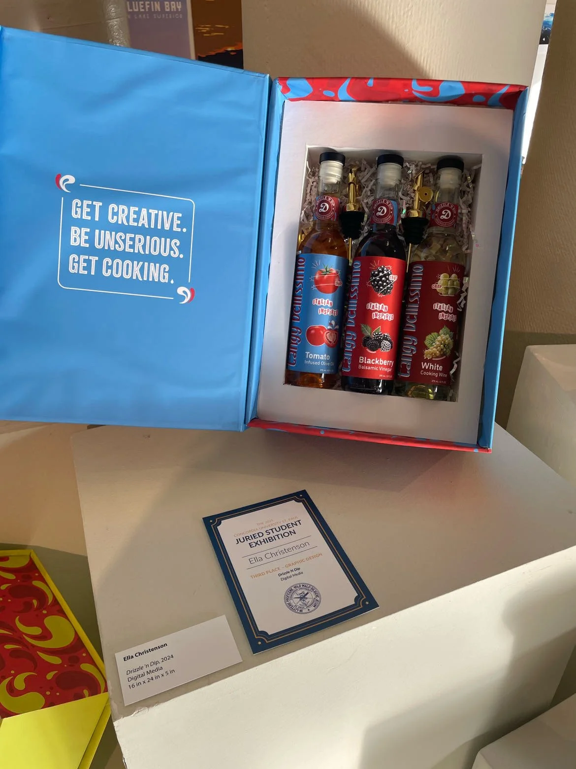
Three collections were developed, inspired by Mexican, Chinese, and Italian cuisines. Each set features infused or flavored balsamic vinegar, olive oil, and cooking wine, with packaging that reflects the energy, color, and personality of each culture.
The concept reframes cooking as an experience, encouraging users to explore new flavors and create meaningful moments through food.
DELIVERABLES
Brand Identity, Packaging System, Bottle Label Design, Art Direction, Product Line Expansion
MY ROLE
Brand Designer, Packaging Designer, Art Director


BRAND IDENTITY
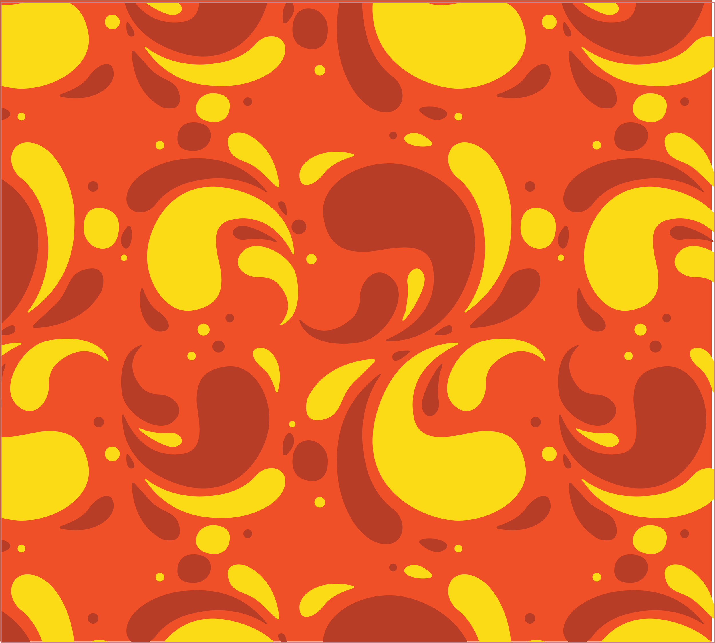
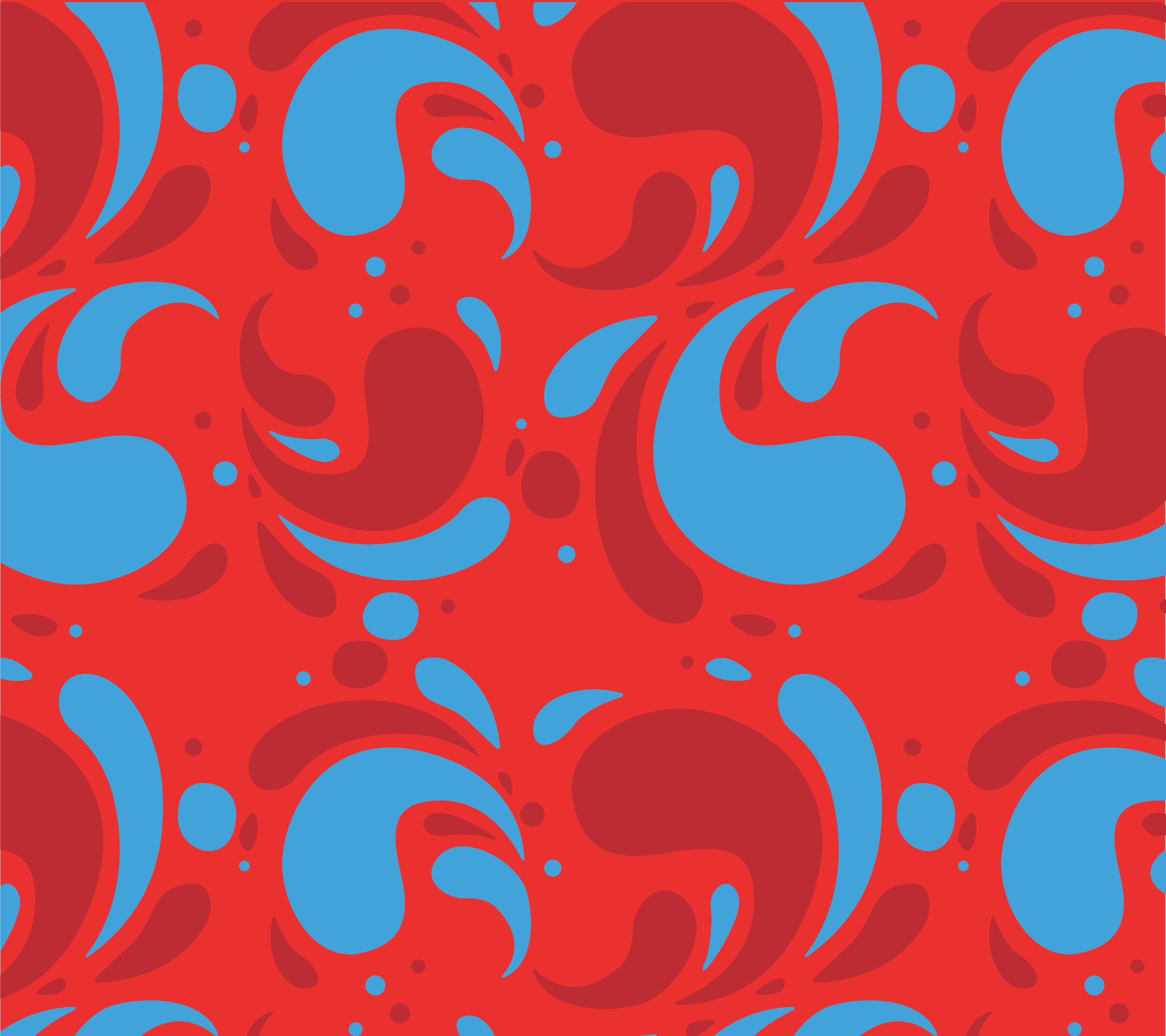
The identity system was designed to feel energetic, welcoming, and expressive. Bold color palettes distinguish each cuisine while maintaining overall brand cohesion, allowing the system to feel both unified and dynamic.
Typography balances clarity with personality, while graphic elements and patterns introduce visual storytelling across each label. Together, these elements create a brand that feels collectible, memorable, and scalable across future product lines.


PACKAGING EXPERIENCE
Expanding beyond the original scope, the project evolved into a complete product ecosystem. The final system includes nine bottle designs and three curated gift sets, each designed to function both as retail packaging and as a cohesive set.
Each collection pairs three complementary products, encouraging discovery and interaction. The packaging is designed to feel display worthy, transforming everyday ingredients into something that feels thoughtful and giftable.


EXHIBITION
The project was featured in a graphic design pop up exhibition, where the full Drizzle n’ Dip collection was displayed as a cohesive brand experience.
Seeing the work come to life in a gallery setting highlighted the level of detail and craftsmanship behind the project. The display included fully constructed packaging, with custom inner box wells and carefully assembled bottle presentations. From designing the system to physically building each component, the process required both creative and technical problem solving.
This exhibition emphasized the project’s scale and ambition, showcasing it not only as a packaging concept but as a fully realized, tangible brand experience.
DESIGN IMPACT
Drizzle n’ Dip demonstrates how packaging can move beyond function to become a storytelling experience.
By combining cultural inspiration with a cohesive visual system, the project transforms everyday cooking products into tools for creativity, exploration, and connection.
BEHIND THE SCENES
Process played a key role in developing the final system. Early exploration included naming, logo iterations, and visual direction studies to establish the tone of the brand.
Label designs were developed through multiple rounds of refinement, testing color combinations, typography, and layout systems to ensure each collection felt distinct while remaining cohesive. Additional exploration focused on how patterns and graphic elements could reflect cultural inspiration without relying on stereotypes.
These iterations allowed the project to evolve from a simple packaging concept into a fully realized and scalable brand system.